
Twyla Tharp
The Creative Habit: Learn It and Use It for Life.
From Publishers Weekly
Perhaps the leading choreographer of her generation, Tharp offers a thesis on creativity that is more complex than its self-help title suggests. To be sure, an array of prescriptions and exercises should do much to help those who feel some pent-up inventiveness to find a system for turning idea into product, whether that be a story, a painting or a song. This free-wheeling interest across various creative forms is one of the main points that sets this book apart and leads to its success. The approach may have been born of the need to reach an audience greater than choreographer hopefuls, and the diversity of examples (from Maurice Sendak to Beethoven on one page) frees the student to develop his or her own patterns and habits, rather than imposing some regimen that works for Tharp. The greatest number of illustrations, however, come from her experiences. As a result, this deeply personal book, while not a memoir, reveals much about her own struggles, goals and achievements. Finally, the book is also a rumination on the nature of creativity itself, exploring themes of process versus product, the influences of inspiration and rigorous study, and much more. It deserves a wide audience among general readers and should not be relegated to the self-help section of bookstores.
Twyla Tharp’s new book, The Creative Habit, is
1. Practical and straightforward, two attributes to be expected from a dancer. Dancers wrestle daily with the obstinacies of the flesh. It’s not about smoke and mirrors. It’s about hard work and commitment, the “habit” of showing up to do the work and developing one’s creativity in the process.
2. Literary and literate. Tharp quotes the Bible, Dostoyevsky, Mozart, and many other greats of the Western Canon to illustrate her points and show that the struggle to be creative is nothing new and that great artists have fought the same battles as anyone who strives to create.
3. Accessible. There’s no mystery or theory of genius here other than the habit of work. Tharp constantly makes the point that we have to establish habits for our creative pursuits or the work will not get done and the creativity will have no place to manifest.
4. Myth Busting. Mozart didn’t get his musical genius from On High; in fact, he worked his fingers into early deformity from practicing so much. Not that Tharp proposes hurting oneself in the creative quest. She’s merely making the point that practice is supreme, not sitting around waiting for the muse to make an appearance. Her choice of Mozart is historical, but I’ve heard similar about Michael Jordan. When other ball players were out doing whatever, Jordan was on the court practicing his shots.
5. Encouraging. One of America’s greatest choreographers shares her demons with us, so we know our fears aren’t “special,” and no, they won’t go away with success, so stop with the “if only.” Wrestling demons is just part of the process; it comes with the territory.
I love the layout of this book: an airy, elegant use of color, font, and white space, which parallels the visual of her stage work. Tharp is very generous in sharing details of her work regimen and her methods for getting things done. Obviously it works for her. The good news is that because her methods are so practical, they can work for others, too.
Tharp uses photos very sparingly in this book, so if you’re looking for a photo history of her career or her company, this isn’t the book. She focuses on the Creative Habit and she doesn’t make herself or her work the center of the story; she draws on the experience and history of many well-known artistic giants and a few lesser known artists as well.
If you want to create or you’re interested in the creative process, don’t wait for the paperback. I’ve seen many books on creativity, but this is by far the most practical and accessible one I’ve read. Tharp knows that it takes hard work and good habits to create something tangible, and she doesn’t waste our precious time on mystical mumbo jumbo or some magical “way” of the artist. It’s the work, folks.
BA Concorde Lounge
The Good Life
Another classic BBC comedy, another classic set of titles. The graphics at the start of the gently subversive allotment-com – a bird flying round the petals of a flower to reveal the programme’s name – arguably stands alongside anything ever created by Saul Bass. Which is pretty much the biggest compliment anyone could give them.
Packaging Design
 Clean and slick design by Martin Zampach.
 Fruit drinks designed by Templin Brink Design combine beautiful illustration and an interesting form of the bottle. Sexy, striking, catchy and beautiful — package design by R Design Studio from London. The choice of colors is remarkable.
The Warrior
 Can scarcely tell a scarlet tanager from Scarlett O’Hara, but The Life of the Skies had me transfixed from the first page. Jonathan Rosen writes with astounding insight, wit, and compassion. The story he tells here is the best kind of odyssey, an outward journey that ends up highlighting the beauty and daring that live inside of us. Even if you don’t have a son fighting in Iraq, even if you don’t read poetry, even if you think you are immune to the power of a mother’s lament – pick up The Warrior and read it right away. Fran Richey has written some of the most powerful stories I’ve ever encountered. It is obvious that her life was changed by living these poems; yours may well be changed by reading them.
Debating Glass Room

I’m toying with pulling out a few solid sheet rock walls and replacing them with glass.
Kayakers dam drop
Extreme kayakers have been condemned for canoeing down a dam in mid-Wales. A photographer captured the latest incident as one canoeist slid 300ft down the spillway at Llyn Brianne reservoir, on the borders of Ceredigion, Carmarthenshire and Powys. Welsh Water said the practice was dangerous and such activities were banned at the reservoir which has the tallest dam in the UK.
U2 Sweetest Thing
I was checking out the new MTV music site, which incidentally seems to be the same technology implementation with a new user interface/visual design: www.mtvmusic.com This music video is one of the funnest, bravest attempts to pull off a synchronized sequence of comical moments, all without a single cut/edit. It’s basically live the entire way through without stopping.
Sorry, really sorry, really, really, really sorry.
New York Cheat Sheets
NY Times ran an amusing series of illustrations from Christoph Niemann
All New Yorkers develop tricks that allow them to stay ahead of the pack in daily life. These are generally tightly guarded secrets, but now that I don’t live in New York, I have generously decided to share some of mine. What follows are a few handy charts that will, I hope, help readers to improve their lives.

Room Without A View
Gazing at images today of light drenched rooms filled with panoramic views. These days we’d be happier settling for some good looking art on the walls and a discreet hi-fi/flat screen tv. Breathtaking panoramic views are officially reserved for weekends away.


Design for the War Room in ‘Dr Strangelove’
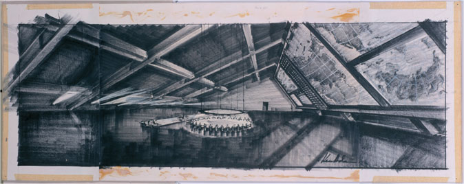
Design for the War Room in ‘Dr Strangelove’ Kenneth Adam (born 1921), UK, 1962
In ‘Dr Strangelove’, the concept for the War Room – the principal setting of this bitterly ironic film about the prospect of nuclear warfare – came from director Stanley Kubrick’s idea for a reinforced-concrete bomb shelter.
Production designer Kenneth Adam dramatised the space by using backlit maps, display boards and a huge circular baize-covered table, which turned defence planning into a poker game. Final concept drawing of felt-tip pen on card for ‘Dr Strangelove or: How I Learned to Stop Worrying and Love the Bomb’, directed by Stanley Kubrick, 1964. Additional section to drawing, 1999 Sir Kenneth Adam, London

Kubrick said:
“As I tried to build the detail for a scene I found myself tossing away what seemed to me to be very truthful insights because I was afraid the audience would laugh. After a few weeks of this I realized that these incongruous bits of reality were closer to the truth than anything else I was able to imagine. After all, what could be more absurd than the very idea of two mega-powers willing to wipe out all human life because of an accident, spiced up by political differences that will seem as meaningless to people a hundred years from now as the theological conflicts of the Middle Ages appear to us today?”
Cool Hand Newman

Paul Newman, the Academy-Award winning superstar who personified cool as the anti-hero of such films as ”Hud,” ”Cool Hand Luke” and ”The Color of Money” — and as an activist, race car driver and popcorn impresario — has died. He was 83.
Newman died Friday after a long battle with cancer at his farmhouse near Westport, publicist Jeff Sanderson said. He was surrounded by his family and close friends.
With his strong, classically handsome face and piercing blue eyes, Newman was a heartthrob just as likely to play against his looks, becoming a favorite with critics for his convincing portrayals of rebels, tough guys and losers. ”I was always a character actor,” he once said. ”I just looked like Little Red Riding Hood.”
Newman had a soft spot for underdogs in real life, giving tens of millions to charities through his food company and setting up camps for severely ill children. Passionately opposed to the Vietnam War, and in favor of civil rights, he was so famously liberal that he ended up on President Nixon’s ”enemies list,” one of the actor’s proudest achievements, he liked to say.
Photomatix magic
A stunning example of bringing together multiple exposures into one image. This powerful plug-in called Photomatix works within Adobe Lightroom. Photographing a high contrast scene, you know that even the best exposure will typically have blown out highlights and flat shadows. Closely examining the foreground, mid-ground and background and you find it’s well exposed in all three areas. These Photomatix examples offers two ways to increase the dynamic range of your photographs:
› Exposure Blending: Merge differently exposed photographs into one image with increased dynamic range.
› Tone Mapping: Reveal highlight and shadow details in an HDR image created from multiple exposures. The tone mapped image is ready for printing while showing the complete dynamic range captured.
Erik Spiekermann
Erik Spiekermann, born 1947, studied History of Art and English in Berlin. He is information architect, type designer (FF Meta, ITC Officina, FF Info, FF Unit, LoType, Berliner Grotesk and many corporate typefaces) and author of books and articles on type and typography.
He was founder (1979) of MetaDesign, Germany’s largest design firm with offices in Berlin, London and San Francisco. Projects included corporate design programmes for Audi, Skoda, Volkswagen, Lexus, Heidelberg Printing and way-finding projects like Berlin Transit, Duesseldorf Airport and many others. In 1988 he started FontShop, a company for production and distribution of electronic fonts. He is board member of ATypI and the German Design Council and Past President of the ISTD, International Society of Typographic Designers, as well as the IIID. In 2001 he left MetaDesign and now runs SpiekermannPartners with offices in Berlin, London and San Francisco.
In 2001 he redesigned The Economist magazine in London. His book for Adobe Press,“Stop Stealing Sheep” has recently appeared in a second edition and a German and a Russian version. His corporate font family for Nokia was released in 2002. In 2003 he received the Gerrit Noordzij Award from the Royal Academy in Den Haag. His type system DB Type for Deutsche Bahn was awarded the Federal German Design Prize in gold for 2006. In May 2007 he was the first designer to be elected into the Hall of Fame by the European Design Awards for Communication Design.
Erik is Honorary Professor at the University of the Arts in Bremen and in 2006 received an honorary doctorship from Pasadena Art Center. He has just been elected an Honorary Royal Designer for Industry by the RSA in Britain.
Peter Sellers
“I have demon masks all over the house, because it’s good to know your demons.” – Peter Sellers

Simple shapes of stories
Short lecture by Kurt Vonnegut on the ‘simple shapes of stories’ using nothing more than chalk, a blackboard, and his famous wit.
From the moment we exit the womb, we tend to hear the same basic stories over and over again. For instance, one wouldn’t normally draw comparisons between Jane Eyre and Avatar, but the two actually share the same trope. You know the one: “boy gets girl, boy loses girl, boy gets girl back.” Most literary folk agree that there are common plots on which all literature is built, though they quibble over the exact number. In this video relic, the late Kurt Vonnegut boils them down to three, which he charts on just two axes. What you get is an old-school infographic of the shapes stories take.
HT @fastdesign
Summer illustrations

This reminds me to send out some summer postcards. I’m digging through my scribbled notes desperately trying to credit the person with such lovely work. Please help identify the designers name please!
Sunnys Bar

Sunny’s last of the longshoreman’s bars in Red Hook, Brooklyn. They are only open a few nights per week, the only visible sign of life is a sign stating the not-so-obvious status as a ‘bar’. Know for poetry readings, stage occasional plays and music gigs.
Simple is hard

No kidding.
I love these little Picasso drawings. Even better when a renowned filmmaker like Scorsese is reminding us about it. Try Sport is simple (when your name is Howies)
