
In terms of ‘pop-up’ spaces, this is one of the greatest projects to have been brought into reality. Design by carmody-groarke architects.
HT @dezeen

Playbook for Business Designers
In terms of ‘pop-up’ spaces, this is one of the greatest projects to have been brought into reality. Design by carmody-groarke architects.
HT @dezeen

Times front page photo. Woman leaps from burning building in London riots. Utter frustration with the spiraling out of control violence, hopelessly stumbling into full scale mayhem. Like modern day dogs of war these feral kids are sly winners.
Police tactics are always failing inner city neighbourhood but the Tory government came up with a life line – a concept of a big society. Well, it just up-ended itself on a lamp post. The Guardian narrative on the 3-day event so-far:
We will likely understand nothing of these events if we ignore the history and the context in which they occur.
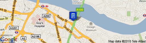
 Foster+ Partners designed those new office buildings near London’s Tower Bridge. One unexpected feature is the shallow (but fast-moving) stream running down the middle of the pavement heading towards Tooley Street away from the Thames. Playful pavement experience or a hazard in waiting. You decide. I’m a big fan.
Props @cybertech

Business-driven companies lead by what has worked. Design-driven companies lead by what is new.

Dreaming about this scene from my home in London. Enjoying the big landscape action on DVD. It’s a Transworld snowboarding classic, TB9 (Amazon: Totally Board Nine) (2001). Every daring act starts with inspiration.

Conceptual simple/smart product from RCA ID graduation show student Il-Gu Cha
A planning clock for office or studio, “The Trace of Time” clock not only tells the time but provides a place for users to make notes: The face of the clock is made of glass and stainless steel. Messages are erased by means of the integrated eraser.
Reactions and comments:
“This idea is incredibly simple yet incredibly stupid at the same time, awesome!”
“People have had whiteboards for years, and they are preferable because they self erase themselves if you’ve decided to put something off etc etc”
“Someone is getting laid at 8pm tonight.”
“The way that the word “genius” is used in that first sentence drives me crazy.I prefer to think of this as made for procrastinators.
“Deadline? What deadline?”
If your passing through London follow your nose down to the excellent Summer Show at the Royal College of Art. Teaching staff [Platform 12] Sam Hecht, Durrell Bishop, Andre Klauser.

Meaning: Attacking imaginary enemies.
Origin: Tilting at Windmills – Tilting is jousting. ‘Tilting at windmills’ derives from Cervantes’ Don Quixote – first published in 1604, under the title The Ingenious Knight of La Mancha. The novel recounts the exploits of would-be knight ‘Don Quixote’ and his loyal servant Sancho Panza who propose to fight injustice through chivalry. It is considered one of the major literary masterpieces and remains a best seller in numerous translations. In the book, which also gives us the adjective quixotic (striving for visionary ideals), the eponymous hero imagines himself to be fighting giants when he attacks windmills.
Just then they came in sight of thirty or forty windmills that rise from that plain. And no sooner did Don Quixote see them that he said to his squire, “Fortune is guiding our affairs better than we ourselves could have wished. Do you see over yonder, friend Sancho, thirty or forty hulking giants? I intend to do battle with them and slay them. With their spoils we shall begin to be rich for this is a righteous war and the removal of so foul a brood from off the face of the earth is a service God will bless.”
“What giants?” asked Sancho Panza.
“Those you see over there,” replied his master, “with their long arms. Some of them have arms well nigh two leagues in length.”
“Take care, sir,” cried Sancho. “Those over there are not giants but windmills. Those things that seem to be their arms are sails which, when they are whirled around by the wind, turn the millstone.”
The figurative reference to tilting at windmills came a little later. John Cleveland published The character of a London diurnall in 1644 (a diurnall was, as you might expect, part-way between a diary or journal):
“The Quixotes of this Age fight with the Wind-mills of their owne Heads.”
The full form of the phrase isn’t used until towards the end of the 19th century. For example, in The New York Times, April 1870:
“They [Western Republicans] have not thus far had sufficient of an organization behind them to make their opposition to the Committee’s bill anything more than tilting at windmills.”

Excited to view his new exhibition at the Met.
Britain’s bad-boy painter.
Self-taught, controversial, and revered, Francis Bacon was one of the most talented figurative painters of the 20th century. This year, a major traveling retrospective marks the centenary of his birth.
He left home at 16. Banished by his father after being caught wearing his mother’s clothes, Bacon drifted between London, Berlin, and Paris for the next several years — surviving as a gambler and hustler.
Bacon got his start as a designer. He first gained notoriety for his modernist furniture and rugs, but quickly abandoned that career to focus on painting surreal, fragmented subjects, based on found photographs and reproductions.
He immortalized his fellow barflies. From the ’60s onward, Bacon painted twisted visions of his inner circle of drinking pals, including his lover George Dyer, who he first met when Dyer burglarized Bacon’s pad.
View work from Bacon’s traveling retrospective (and visit the exhibition in New York), read three classic interviews, watch video of the artist from the BBC archives, and buy the exhibition catalogue.
Via Paul Laster from FlavourPill
Ideas Worth Sharing? Obviously that’s an improved TED’s tag line but it got us thinking about ‘lens’ and ‘filters’ on what we share, to whom and why, especially in this twitter frenzy world. Concepts like ‘pass it forward’ are certainly nice gestures to the community. Keep it simple/smart is our philosophy, ask yourself today how to be USEFUL, with your relationships, your designs, to your users, now step it up, ask yourself how to be VALUABLE?
Tim Brown (IDEO) talking about PLAY and CREATIVITY. In essence: It’s the need for playful ideas to firstly branch out in large quantities before rightfully converging, revealing deeper insights and sparks of excitement. His talk about the need for PLAY is a central theme of IDEO. This really is a philosophy that accidental experiments happen during the course of designing, which spark new ideas, which lead to better big picture thinking. I wish Tim had cited more frames of reference to fully bake this idea into more tangible terms. Great talk.
David MacKinnon view on creativity
Full disclosure: Tim taught as a guest lecturer on our RCA CRD course in London.
T-Mobile invaded London’s Liverpool Street station yesterday on Jan 15th to the shock and amazement of onlookers.
350 dancers performed surprise routines as commuters passed through the concourse of Liverpool Street Station at 11am yesterday. ‘Dance’, created by Saatchi & Saatchi London, was produced using hidden TV cameras within the station, which captured the reactions of commuters as they watched the dancers perform. The three-minute guerrilla-style ad, which is part of T-Mobile’s ‘Life’s for Sharing’ campaign aired on British terrestrial TV.
The dancers were similar to Internet based “flash mobs” where hundreds of people organise to meet in a public place and have water fights, pillow fights or parties. As you can see from the video above, the public were initially shocked but got into the swing of things eventually.
 Clean and slick design by Martin Zampach.
 Fruit drinks designed by Templin Brink Design combine beautiful illustration and an interesting form of the bottle. Sexy, striking, catchy and beautiful — package design by R Design Studio from London. The choice of colors is remarkable.
Erik Spiekermann, born 1947, studied History of Art and English in Berlin. He is information architect, type designer (FF Meta, ITC Officina, FF Info, FF Unit, LoType, Berliner Grotesk and many corporate typefaces) and author of books and articles on type and typography.
He was founder (1979) of MetaDesign, Germany’s largest design firm with offices in Berlin, London and San Francisco. Projects included corporate design programmes for Audi, Skoda, Volkswagen, Lexus, Heidelberg Printing and way-finding projects like Berlin Transit, Duesseldorf Airport and many others. In 1988 he started FontShop, a company for production and distribution of electronic fonts. He is board member of ATypI and the German Design Council and Past President of the ISTD, International Society of Typographic Designers, as well as the IIID. In 2001 he left MetaDesign and now runs SpiekermannPartners with offices in Berlin, London and San Francisco.
In 2001 he redesigned The Economist magazine in London. His book for Adobe Press,“Stop Stealing Sheep” has recently appeared in a second edition and a German and a Russian version. His corporate font family for Nokia was released in 2002. In 2003 he received the Gerrit Noordzij Award from the Royal Academy in Den Haag. His type system DB Type for Deutsche Bahn was awarded the Federal German Design Prize in gold for 2006. In May 2007 he was the first designer to be elected into the Hall of Fame by the European Design Awards for Communication Design.
Erik is Honorary Professor at the University of the Arts in Bremen and in 2006 received an honorary doctorship from Pasadena Art Center. He has just been elected an Honorary Royal Designer for Industry by the RSA in Britain.

Like many future filmmakers, British-born Christopher Nolan began making amateur movies at an early age, playing around with a Super 8mm camera that belonged to his father. When his family relocated to Chicago for three years during his formative years, this child of a British father and American mother traded tips on movie making with pals Roko and Adrian Belic (who in 1998 premiered their documentary “Genghis Blues”). While an undergraduate at University College in London, Nolan saw his short “Tarantella” air in the USA on PBS in 1989. By the mid-90s, he had hooked up with Jeremy Theobold who appeared in the shorts “Larceny” and “Doodlebug”. Theobold would go on to produce and star in Nolan’s feature directorial debut, “Following” (1998). Serving as director, co-producer, co-editor and cinematographer, he inverted some of the conventions of the film noir to recount the tale of a blocked writer (Theobold) who spends his days stalking strangers in the hopes of jump-starting his imagination. Then, one of his “victims” turns the tables and invites the scribe to join in a series of petty thefts. Juggling time via flashbacks and flash forwards, Nolan established a key signature of his work in which chronology takes a back seat to character. Critics found much that was admirable in Nolan’s first feature, although most felt it was a marginal achievement, at best.
Nolan took a giant leap forward with his second film, “Memento” (2000), working from an unpublished short story by his brother Jonathan. An intriguing skewering of the conventions of film noir, “Memento” centers on a man with “anterograde amnesia”, a condition that does not allow him to form new memories, who is seeking the man who raped and murdered his wife. While the heart of the piece was a conventional revenge drama, the story unfolded in an intriguing manner — backwards, with bits of additional information added each time. Fascinating and complex, “Memento” earned great acclaim when it opened in Europe in fall 2000 and at its US premiere at the 2001 Sundance Film Festival where Nolan picked up the Waldo Salt Screenwriting Award. The film also earned him numerous citations from critics’ groups. Despite the fact that the idea for the story originated with his brother’s fiction, Nolan’s screenplay was deemed an original for the purposes of Academy Award consideration, in part because the film had premiered in both Great Britain and the USA before the short story was published in the March 2001 issue of Esquire. Capitalizing on his success, Nolan directed the English-language remake of the 1997 Norwegian crime thriller “Insomnia” (2002), starring three previous Academy Award winners, Al Pacino, Robin Williams and Hilary Swank . The critical response to the film was mixed: while some labeled the thriller as an early Oscar contender and heaped praise on Williams’ smart, controlled performance, others found the film a lackluster sophomore follow-up to the bravura efforts of “Memento.”
Nevertheless, Warner Brothers, which produced “Insomnia,” was still confident enough in Nolan’s talents to tap him to direct its long-aborning effort to revive the all-but-defunt “Batman” franchise after various other incarnations failed to make it into production. Teaming with screenwriter and comic book author David S. Goyer, who’d previously translated the “Blade” character from comics to film, Nolan took the film series 180 degrees from its increasingly gaudy and campy direction, envisioning “Batman Begins” (2005) as a pitch-black, deadly serious psychological exploration of the origins of the legendary comic book superhero. Taking direct inspiration from many sequences from the post-“Dark Knight Returns” era of the comics, Nolan’s film traced Bruce Wayne’s journey from orphaned millionaire to intensely skilled crimefighter, taking pains to craft both a Gotham City and an outer world that was as realistic as its pulpy source material would allow and eschewing over-the-top theatrics and computer-generated special effects in favor of nuanced acting and old-fashioned stunt work. Nolan and Goyer’s take attracted an all-star cast, including Michael Caine as Wayne’s faithful aide Alfred; Gary Oldman as Jim Gordon, Gotham’s sole uncorrupt cop; Morgan Freeman as Lucius Fox, the provider of Batman’s technology; and Liam Neeson as the mysterious, machiavellian Henri Ducard; but the true discovery of the film was Christian Bale in a star-making turn as the titular superhero. Though the film lacked some of the darkly manic pop inspiration that characterized the Tim Burton films, “Batman Begins'” soberer take was a breath of fresh air for loyal fans of the comic books and moviegoers turned off by Joel Schumacher’s more recent camp efforts, and the film proved to be both a critical and commercial success. Nolan was set to return to the franchise for “The Dark Knight” (scheduled for release in 2008) reteaming with Goyer on story chores (with a script by Nolan’s brother Jonathan) and helming again, this time with Heath Ledger in the role of the iconic villain The Joker.
* Born:
July 30, 1971 in England
* Job Titles:
Director, Screenwriter, Director of photography, Producer, Editor
Family
* Brother: Jonathan Nolan. wrote short story upon which “Memento” (2000) was based
Education
* University College, London, England, English
Milestones
* 1989 Made short “Tarantella” which received airing on PBS in USA
* 1996 Short film “Larceny” screened at the Cambridge Film Festival; Jeremy Theobald made acting debut
* 1998 Feature directorial debut, “Following”; Theobald starred and served as one of the producers
* 2000 Helmed second feature, the acclaimed thriller “Memento”, adapted from a story by his brother
* 2002 Directed the English-language remake of “Insomnia”
* 2005 Directed and co-wrote the fifth Caped Crusader installment “Batman Begins” which starred Christian Bale as Bruce Wayne/Batman
* 2006 Directed Hugh Jackman and Christian Bale in “The Prestige,” about rival magicians working in early-20th-century London
* Began making short films at age seven
* Collaborated with Theobald on the short “Doodlebug”
* Spent three years of his youth living in Chicago; made early films with Roko and Adrian Belic (the future Oscar nominees for the documentary “Genghis Blues”)
Two London based product designers have learnt to be adaptive and figure out way to get products out of the door. They describe the story, about humble beginnings from a basement in North London. Suck UK is a highly awarded and respected source of inventive and often inspiring products.

SUCK UK produce furniture, lighting, interior products and accessories. Design is mostly by Sam and Jude or selected by them from some of the best designers around the world.
The story … IN THE BEGINNING… we started out doing stuff for other people. One off eclectic projects attracted commissions from architects and other designers. The idea to produce actual commercial products came from working on low budget film, TV, and interior jobs (but mainly from the gaps between the jobs). SUCK (the brand) was established in late 1999 from humble beginnings working on a kitchen floor in a bedsit in North London. We worked on our own concepts making stuff that we liked for no-one in particular: products with Glamour and pure industrial forms, off-the-wall and unnecessary functionality, things to grab your attention without resorting to kitsch or parody. We used materials that we knew about and experimented with ones we didnt. We obsessed about processes and materials, always working towards elegant (Cheap) production solutions. Working in this cramped environment with no outside support made learning hard and fast. We worked (unfortunately for the neighbours) through the night and filled our days with dead-end jobs to buy materials and pay the phone bill. Money was unbelievably tight and a unique ability to utilise our surroundings and whatever tools we could get became a way of life. With trial and error we learned to cannibalise existing products, combine materials in new ways and to scrounge professional expertise as often as possible. It was fast becoming evident that our makeshift studio was completely inappropriate, kitchens are no place for sheet metal fabrication, sticky chemicals and spray paint. Our flat-mates decided enough was enough and they wanted their home back. New premises were required and with no money the solution came in the form of an empty room in a squatted embassy building in Primrose Hill. The only room without boards at the windows became our studio and a nearby phone-box the office. It was damp, dark and smelt but there was lots of room to experiment in. It was at this time that we really started to develop our products, banging together prototypes with whatever materials were at hand and attempting some sort of small-scale manufacture. Now SUCK really started making progress and developing some sort of a direction. We were working on stuff that wouldnt look out of place in Londons clubs and galleries but we wanted to get this into peoples houses… Production was set back by an unexpected eviction late one night. Most of our old equipment was lost as we scrabbled around on the floor gathering up our stuff with bemused police officers looking on in disbelief. We made it out with our prototypes intact and the determination and confidence to quit our day jobs and put all our energy into developing the brand. Two moves later and we are now based in a East End studio like proper designers. No sooner than the dust has settled and we are planning a permanent exhibition space… We refuse to restrict ourselves to any one material or technique. Each of our products is different from the next and as we discover different ways of working and new materials we incorporate these into new products. SUCK is not a craft based company, we design based on our knowledge of how, why, where and what is possible. We work closely with specialist manufacturers in many fields so we get the benefit of years of manufacturing expertise without having to physically learn the craft. As time passes a more recognisable SUCK Style is emerging and we are already ditching some of the earlier products which helped launch the company as we introduce newer ideas. Our stuff is attracting a lot of attention from the public as well as the press. We have appeared in the usual interior mags and Sunday supplements. We have even represented the face of “contemporary design” on the BBC. Public reaction to our products was fantastic when we launched at Mode in June 2000 (we kept it quiet that everything at the show was only at the prototype stage and nobody seemed to notice!). We have been presented an award for ‘Most Innovative New Product’ by Terence Conran (It took another ten months before The Conran Shop itself agreed to stock our stuff) and Best ‘In Show at MODE’. We are now represented in all the big ‘name’ department stores as well as loads of indie shops (who supported us from early on). We are never content however, and the next few months will see us release some of the best new products to come out of the UK in a long time… SUCK UK is products designed by Sam and Jude Central Saint Martins 96 (BA Product Design)
The Norman Foster design, on the south bank of the Thames near Tower Bridge, is a deliberately iconic building. Its form – a distorted glass sphere, sometimes seen as head-shaped – is justified in terms of two sorts of function: environmental, reducing the total glass surface area of the building; and democratic, with the whole building designed around a magnificent interior ramp down which the people can symbolically walk above the debating chamber of their elected representatives. Link
The monstrous handsets are gone, check out the slender and sleek sat phones. Would they tempt you back now that the original clunky devices have seemingly dropped off the map? During the NY blackouts and the recent London terror campaigns, the mobile phone network was knocked out by the instantaneous spike in phone traffic. Expeditions to mountainous regions still rely on these bad boys.
