
The vast majority of the world’s communications are not carried by satellite, but an altogether older technology : cables under the ocean.

HT @guardian

Playbook for Business Designers
The vast majority of the world’s communications are not carried by satellite, but an altogether older technology : cables under the ocean.
HT @guardian
300,000 Norwegians move house every year. If the pattern made by this process could be compressed into one short animation, what would would it look like? What could you learn about your country from such an animation, if anything?
Deluge is a C++ application designed to answer these questions. The underlying data was generated by cross referencing Norwegian tax records from 2006 and 2007 to find changes in postal codes.
HT @Even Westvang via @Notcot
Lovely and simple.
Over the past few weeks, Fanthom have being building two interactive installation pieces for the lobby of GE’s headquarters in Fairfield, Connecticut. The pieces are part of the GE Works campaign, which describes and organizes the company’s work with four verbs: Powering, Curing, Building, and Moving. Fathom’s job was to show how data can illustrate these first two activities.
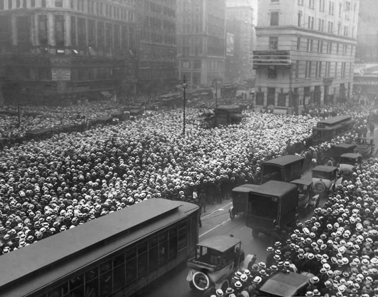
 See something or say something: New York
Red dots are locations of Flickr pictures. Blue dots are locations of Twitter tweets. White dots are locations that have been posted to both.
HT @ericfischer
Calling a crowd of people an abstraction of a boxing match is a bit like decoding this data visualisation.


This is one incredible temperature dataviz of Helsinki temperature 2010 by designer, nicotron. “Colourdar is a data visualization project annual temperature of different cities in a calendar format.”
See more of Nick’s temperature visualizations at: colourdar
